UX Case Study
MADE EASY is a reputed pioneer in the ESE, GATE and PSUs exam preparation, setting up new benchmarks year on year and has established itself as a success partner of thousands of engineering graduates in various competitive examinations and personality tests.

UI | UX | Branding | Website | App
OVERVIEW
The pandemic has disrupted the in-class experience in the education industry. All the institutes had to shift their offline classes to online ones which was quite a task for them since the experience the students and teachers get during the offline class was totally different.
MADE EASY is a reputed pioneer in the ESE, GATE and PSUs exam preparation, setting up new benchmarks year after year, and has established itself as a success partner of thousands of engineering graduates in various competitive examinations and personality tests.
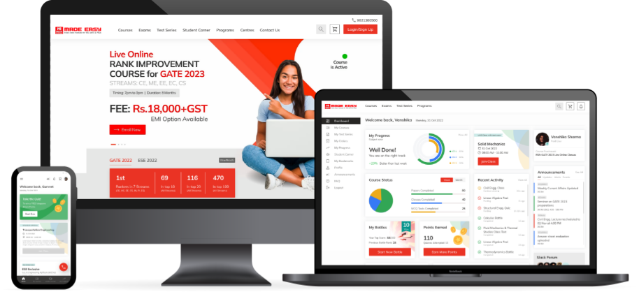
We were approached by MADE EASY to rebuild their website, take their design to the next level, produce a delightful user experience, upgrade and provide a seamless learning experience online too.
TASK
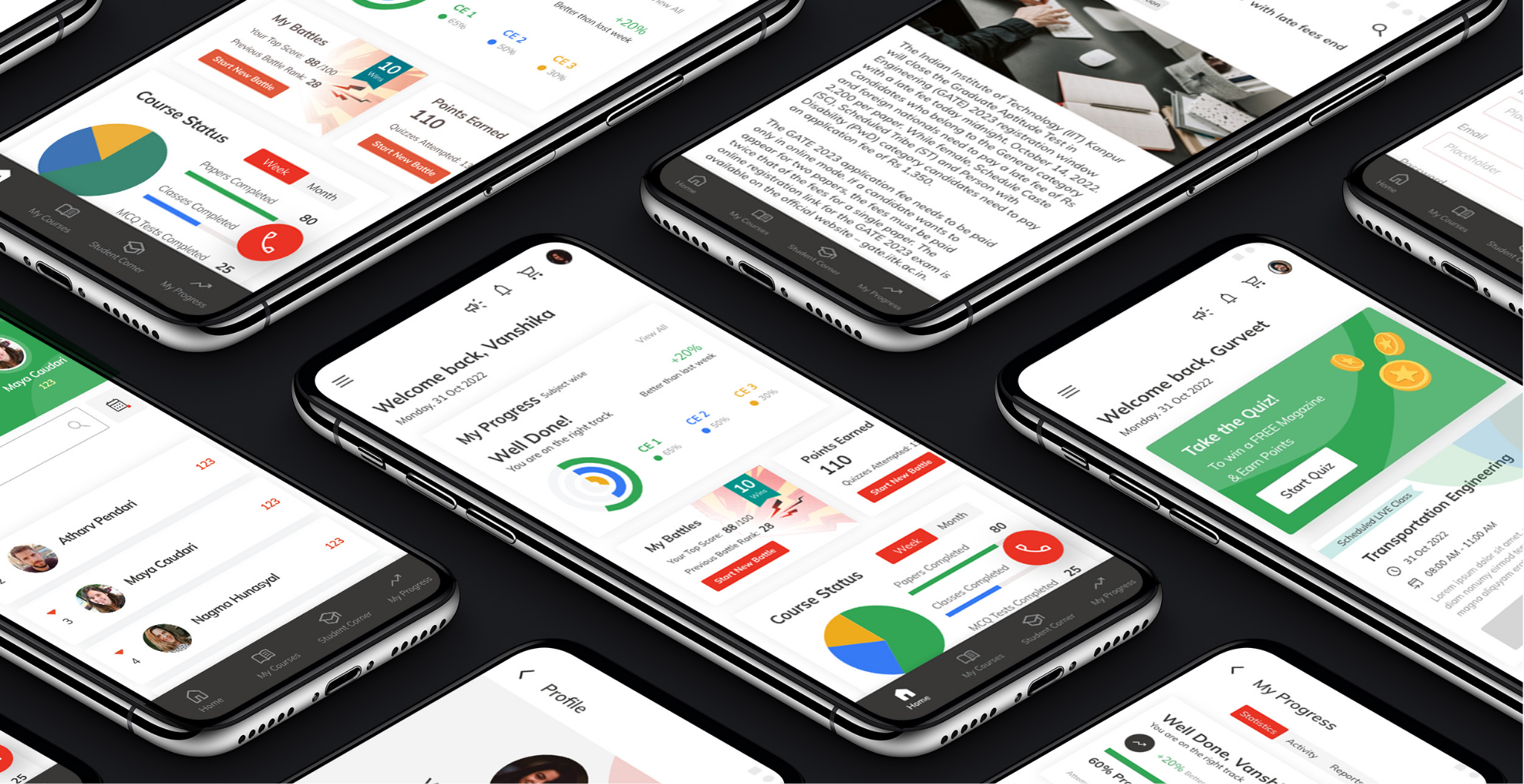
The task was to redesign their website and design a mobile app and a web app that provides a seamless experience and to provide a smooth transition from offline to online classes.
Research
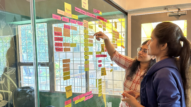
The research methods predominantly followed were: Kick-off calls, Stakeholder interviews, Competitor Analysis, UX Audits, User Interviews, User Surveys, Contextual Inquiries, etc.
We kick-started the project with the Stakeholder interviews with the majority of MADE EASY team. We spoke to the chairman, management and marketing team members, and teachers and gleaned many insights.
Major goals
for the project
01
Easy, effective and
efficient user flows
02
Increased student
teacher engagement
03
Seamless offline and
online experience
04
Increase conversion
and retention rates
05
One portal
for all needs
06
Enhance
the user interface
Conducting
user surveys
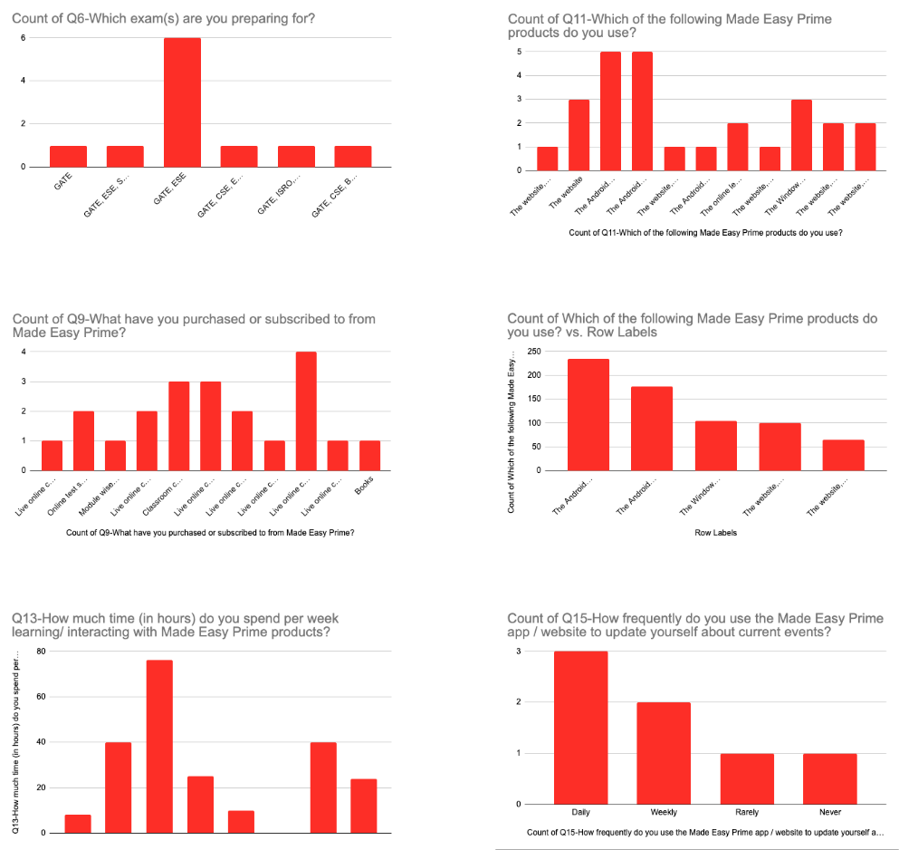
We conducted a user survey to gain user insights. To reach a larger audience, we wrote a short survey and posted it on different MADE EASY student communities and Facebook groups that matched the target user profile. We received over 1000 responses.
Results:
On average a student spent more than 50 hours a week interacting with MADE EASY products. (Website, mobile app, and desktop app)
Insight: Easy, effective, and efficient user flows and clean and minimal UI
The majority of the users visited the website daily for study material.
90% of the students wanted a progress tracking system and a push for them to improve their weaker subjects.
Insight: The student dashboard would help them track their progress, view performance, and have their study material and everything in one place.
Users were frustrated about having to spend time visiting different sites to study and get study material.
Students religiously followed their schedules and were a part of discussions or study groups on Telegram.
Insight: Integrated discussion forums and customised calendars on the MADE EASY site would be very useful.
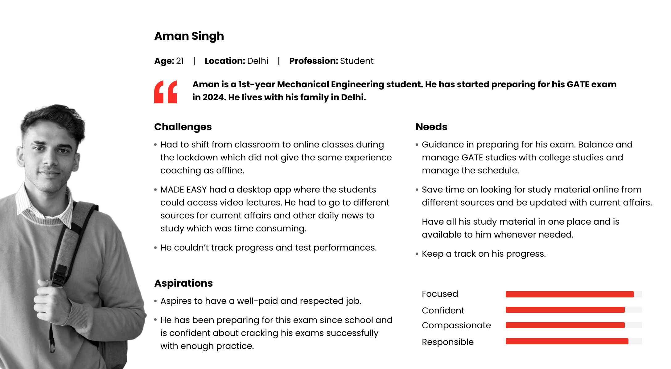
User personas
Based on the user research, we worked on a User Persona. We referred to it during the entire design process. The user scenario had a realistic goal that the user might have when using the product.
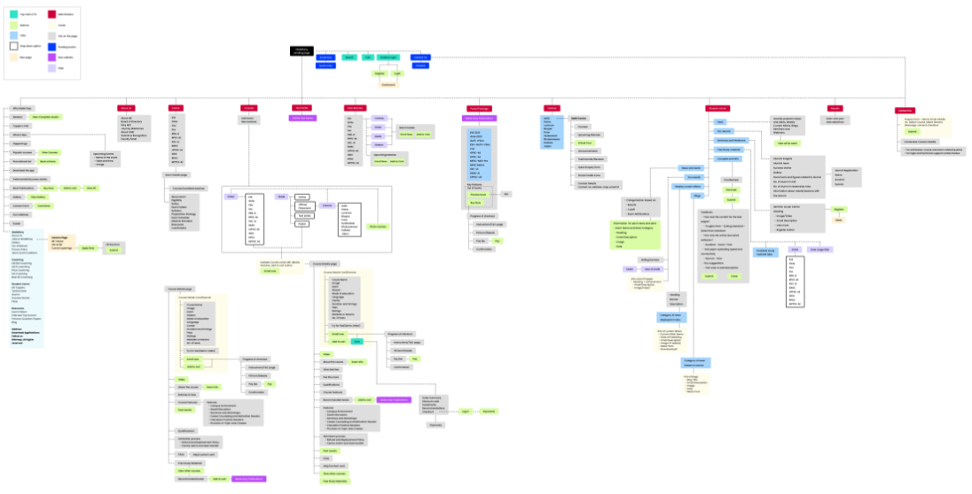
Information
Architecture
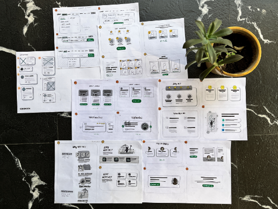
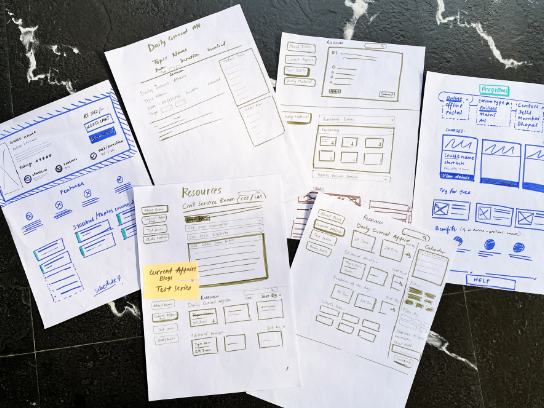
Wireframes
Sketches
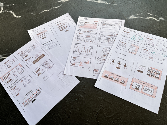
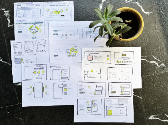
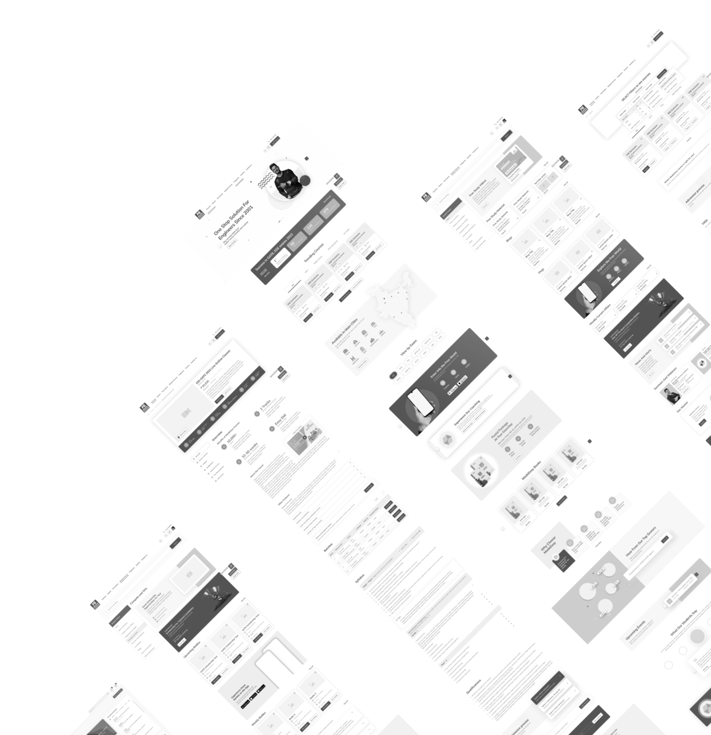
HIgh FIDELITY Wireframes
With all research and planning in place, we wire-framed core experiences and scenarios. The first prototype version of the website enabled a better understanding of the flows and a quick assessment of user experience.
Typography
& Colors
WEB and DASHBOARD
COMPONENTS
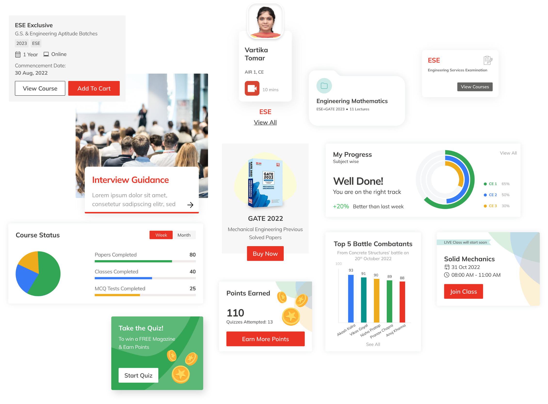
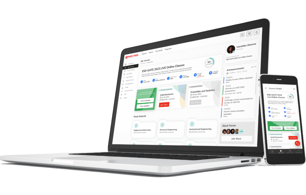
Seamless cross-platform experience and easy access to the courses and study material from anywhere, anytime.
Student CORNER
